After several months of use, I envision the successor to the Remote 3 as follows:
-
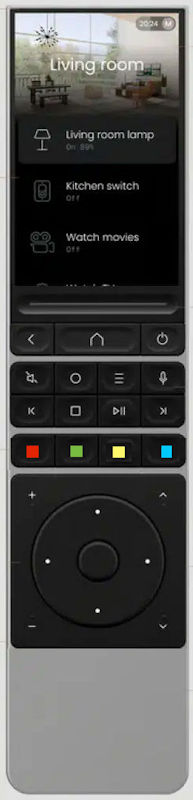
The playback buttons (Play, Pause, Stop, Record, etc.) are moved to the top. This makes them easier to reach and to use.
-
The colored buttons are fixed, as many devices worldwide still use these buttons for various functions. I know: The color keys can be assigned to the display, but the display should remain clear for everything else.
-
The familiar control keys are located below the color keys.
1 Like
I guess all of this is subjective and personal preference. For me personally I like the layout order the way it is on the R3. I never have a use for any of the colour buttons and would not want to see them as physical keys on the remote itself. I would personally like a few more physical keys that could be used across all activities for things like lights for quick access and without using up the screen space.
I added a picture on my startpost but it’s only shown after login.
So why not for all users/visitors and without login?